Design system · Recite Me
Recite Me Design System
One source of truth for a growing product suite, keeping every product consistent, accessible and quicker to build.
- My role
- Lead UX Product Designer
- Recite Me
- Design system
- Summary
- I built the Recite Me Design System: one source of truth for colour, type and accessible components, so every Recite Me product looks and behaves consistently and teams can design and build faster.
- Tools
- Figma
- What I did
-
- Audit
- Foundations
- Components
- Documentation
- Developer handover
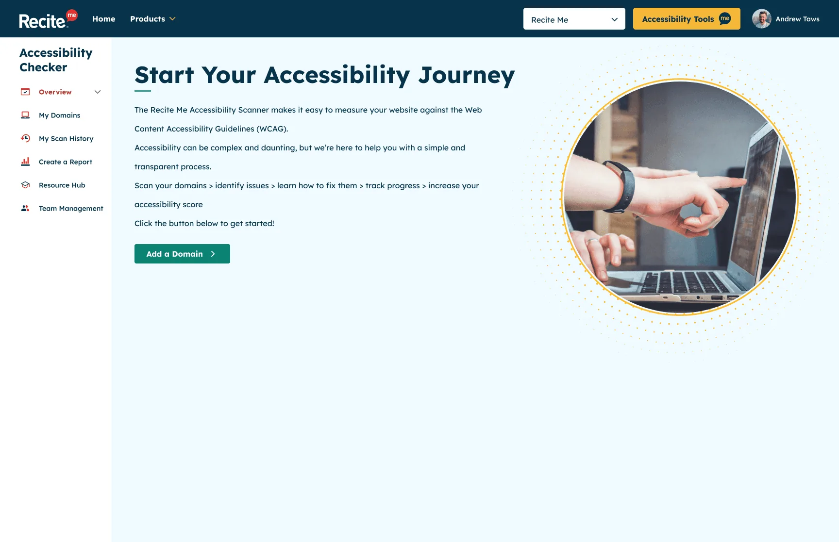
Overview
As Recite Me’s portfolio grew, so did the number of ways a button could look. Each new product brought its own patterns, colours and quirks, and small inconsistencies were starting to add up.
The Recite Me Design System brought everything back together. It’s the single source of truth for the visual and interactive elements across our products, giving users a consistent experience wherever they meet us, and giving designers and developers a faster, more reliable way to build.
The challenge
- Inconsistency across products. Different teams and timelines meant the same component could look and behave differently from one product to the next.
- Slower delivery. Without shared components, designers and developers were rebuilding the same things again and again.
- Accessibility at risk. For an accessibility company, every inconsistency is a potential barrier. Accessibility needed to be built in at the component level, not checked at the end.
My approach
Audit
I started by auditing our existing products to capture every colour, type style and component in use. Laying them side by side made the duplication and inconsistency impossible to ignore, and gave us a clear starting point.
Foundations
The system is built on a set of core foundations:
- Colour: a palette with contrast checked against WCAG 2.2 AA
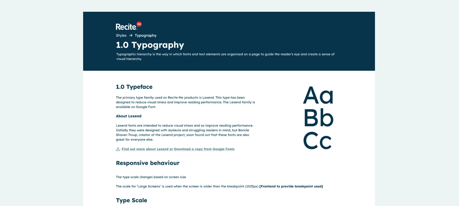
- Typography: a clear type scale for readable, consistent hierarchy
-
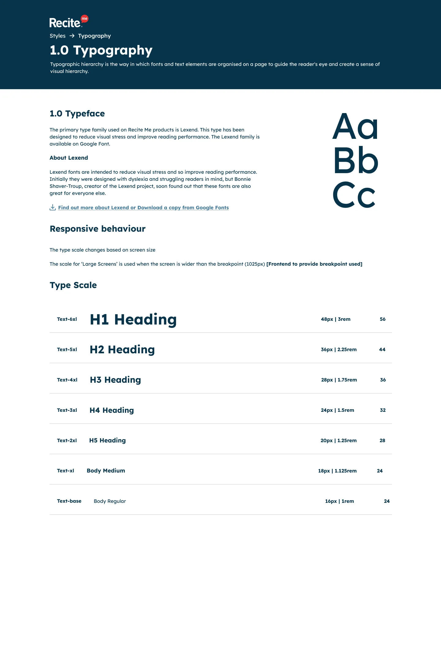
Typography. View full page: Typography -
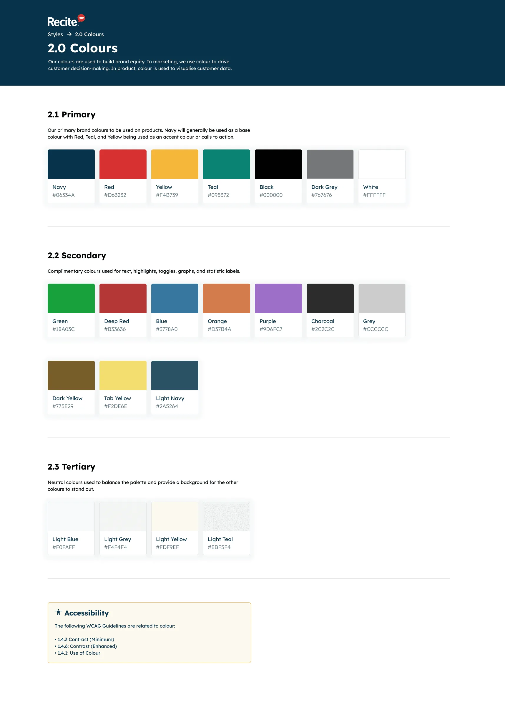
Colours. View full page: Colours
Components
Components were designed with accessibility baked in from the start, including visible focus states, generous target sizes, clear labels and states for every interaction, so teams get accessible patterns by default.
-
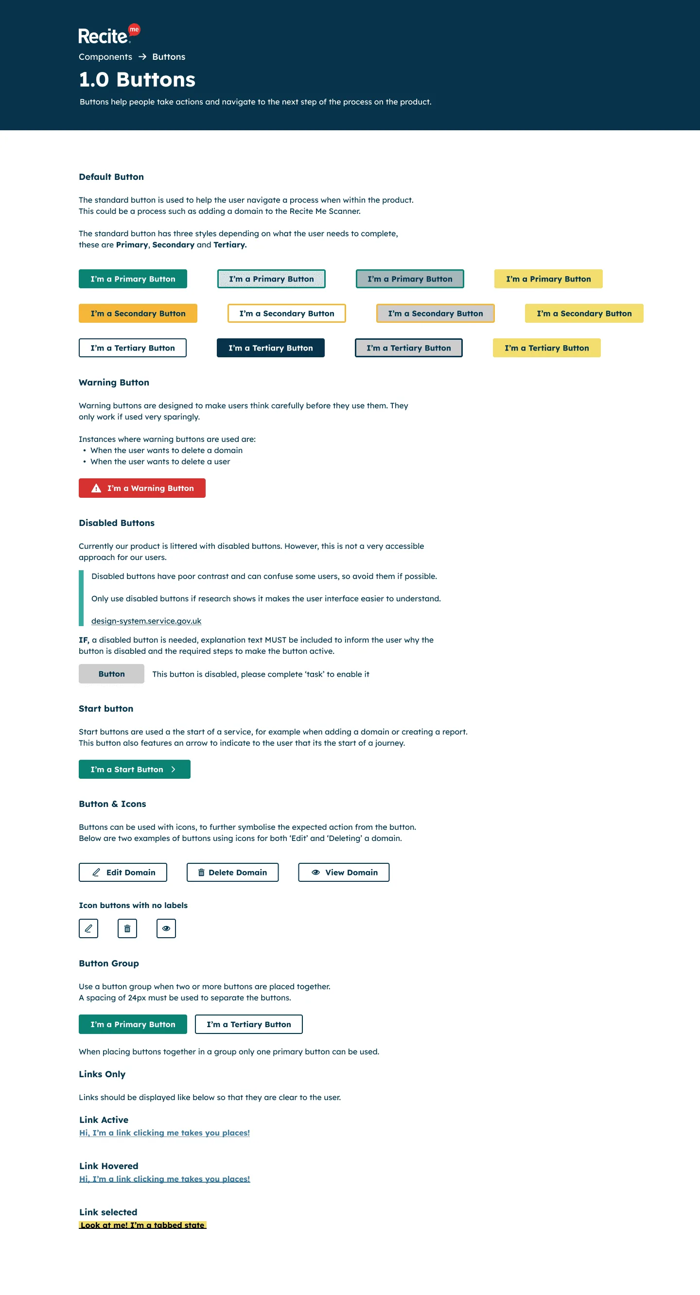
Buttons. View full page: Buttons -
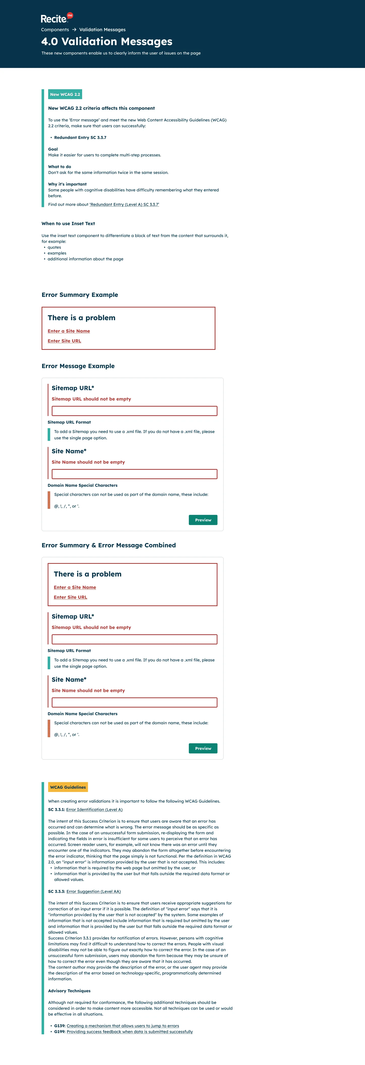
Validation messages. View full page: Validation messages
Documentation and handover
Each component is documented with usage guidance, dos and don’ts, and accessibility notes. I walked developers and QA through the system in Figma to make sure it worked for both design and build.
-
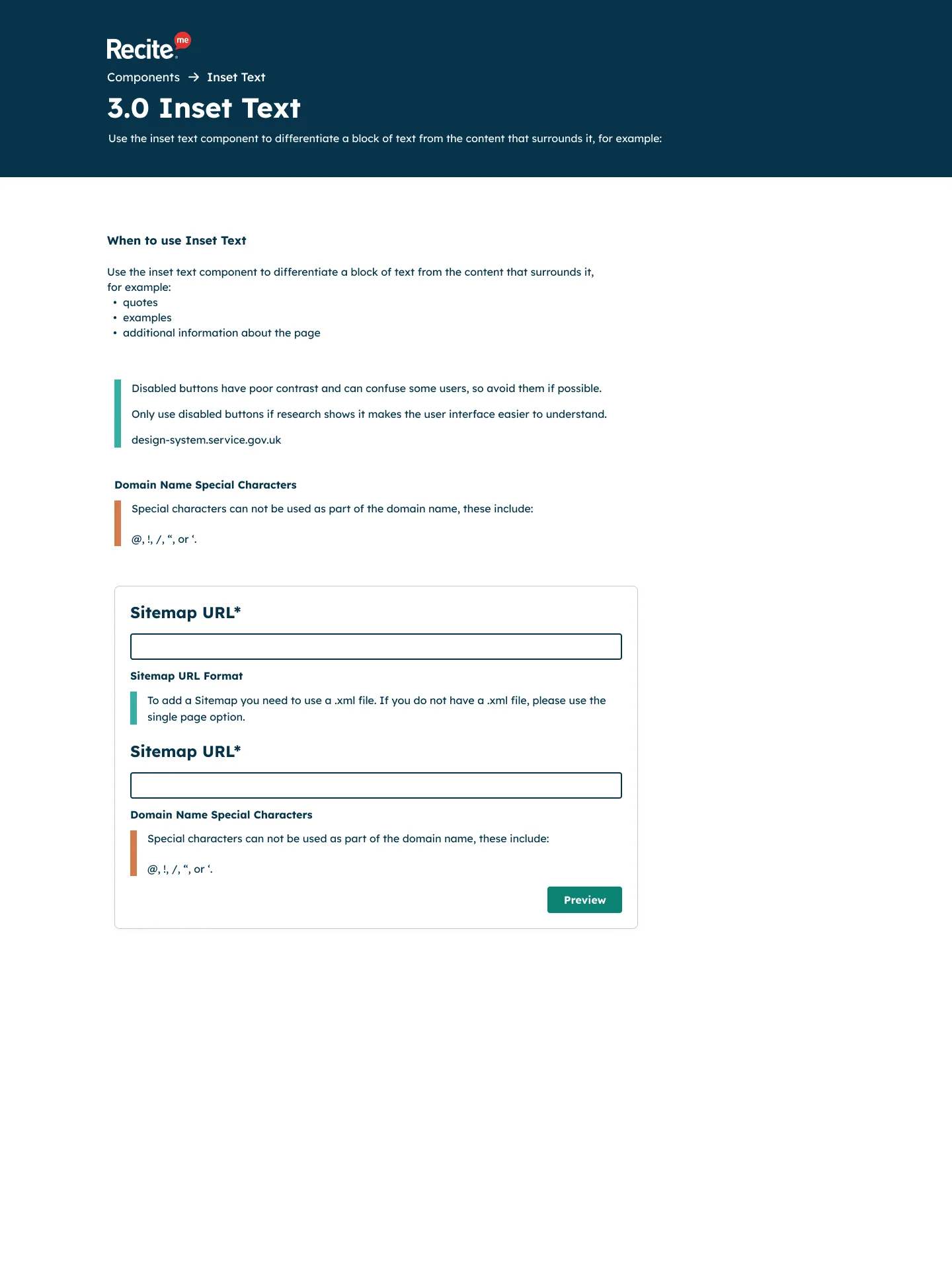
Inset text. View full page: Inset text -
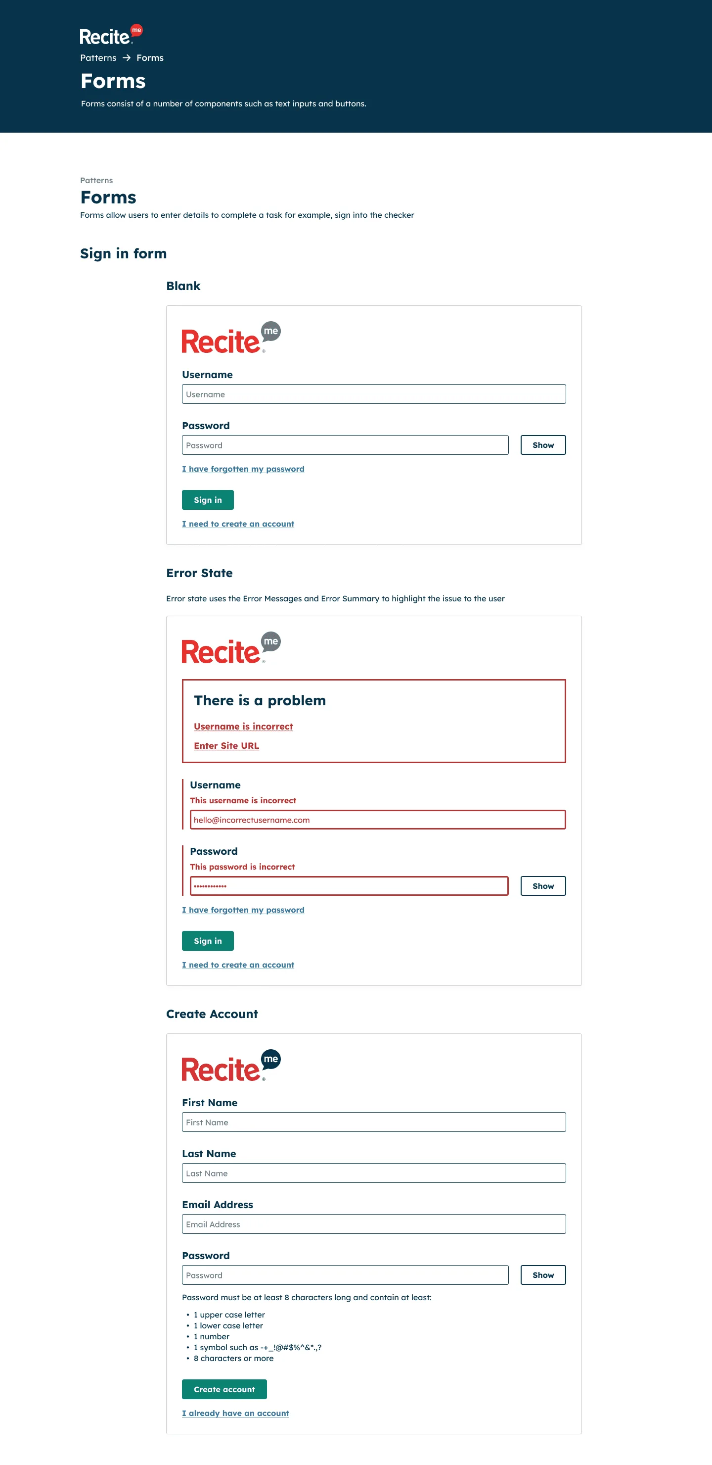
Forms. View full page: Forms
Outcome
The Design System streamlines how we design and build, improving efficiency while keeping every Recite Me product consistent.